Monday 15 December 2014

Eden Project Brief

I chose to visualise the mediterranean range of scents from the eden project brief, primarily because i really like mediterranean colour palettes and i thought that some of the fruits etc would be interesting to draw.
The mediterranean range included:
Black Fig
Bamboo and Olive
Lime-leaf and Ginger

Development:
I looked into the origins of each fruit or fragrance i was illustrating and took my inspiration from a range of photographic sources, creating some quite realistic versions but also quite stylised. After looking at The Eden Project's current range of products for sale i decided to go for quite a literal representation of what i was illustrating but i tried to make it my own with the way i rendered it using watercolour and colouring pencils and i think the combination of the two gives a really nice effect.


Final Designs:
This is perhaps the least successful of my three final designs but i still am pleased with the result. The packaging was looking quite plain with disparate elements in it before i put in the striped background and i think it looks alot better now. The striped are an easy theme i can transfer across to the other designs (and potentially to other products) to reinforce the idea that these fragrances come in a set. 
 This design works much better on the packaging i think and the colours work well together. I am glad i stuck with the green background as it gives everything a natural feel which enhances the Eden Project's ethos.
 This is my favourite design, mainly because i think the colours work well together but also because i think the observational images of the figs are full of life and texture which adds to the packaging.


Thematic and Creative Research...

http://uk.pinterest.com/charmainemcdono/abecedaries-etc/

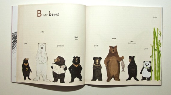
The above link is to my pinterest board where i have been collecting images and inspiration regarding A-Z books. This research contains examples of books that i admire because of their structure, illustrative style or ingenuity of ideas. For example:
Katie Viggers' "Almost an Animal Alphabet" is an A-Z book which is beautifully illustrated and adheres to the normal picturebook format whilst still being slightly different to other books in this genre. 

"The Incomplete A-Z" by Sarah Dyer is very different in that, structurally, it breaks the 'rules' regarding picturebooks and the illustrations can only be seen in order when it is unfolded as an A2 poster. 


The above link is for my picturebooks pinterest board.  This is similar to my A-Z board but it is much broader and i use it mainly for creative inspiration and investigating contemporary design. 


Other books I have been looking at...


 Oliver Jeffers "Once upon an Alphabet" (2014) 

I bought this book because i really admire Oliver Jeffers' work. It was a happy coincidence that his newest publication would be an A-Z book! Within this book, Jeffers' has investigated and played with the relationship between words, letters, images and stories to create a wonderfully playful anthology of tales which will no doubt entertain children (and adults) of all ages. 


Friday 5 December 2014

Hallmark Brief

I was not 100% sure about undertaking the Hallmark brief as part of AD32 but I am really glad that i did. It has provided me with ample opportunity to experiment with drawing and creating new characters which is a vital tool if I intend to become a children's book illustrator in the future. I had lots of fun with this task and i think it has been useful as a first project because it got me using my sketchbook a lot, experimenting with shapes, form, materials and preparing me for the rest of my projects.
Character designs and roughs etc can be found in my sketchbooks, the following are my more finalised designs...
My character has undertaken many changes...At first the lines were much darker as i had drawn them in brown pen but after the group crit and a bit of self evaluation, i could see that the lines were too dark and were taking focus from the eyes. It was also pointed out that the eyes were quite small so i changed them on my designs and am now really happy with the results.

I got really into this project and very invested in the character i had created and this prompted me to make some 3D versions of my design.
 This model is made from supersculpey and i made it as a pencil topper to demonstrate a different way my design could be used by a card company that manufactures such a big variety of products. I could easily have drawn a plan for this sort of product but i really would like to enhance my modelling skills and make more 3D objects in future projects so i thought this would be a great opportunity to practice. I also just really love making things!

Due to the knitted pattern I had tried to illustrate on my character i really wanted to see what the 'real' creature would look like! It is by no means perfect but i think that it is it's imperfections which make the toy even cuter than before. The eyes are bigger on the toy because i had to use buttons and this led me to change the size of the eyes on my illustrations too which makes them look cuter and stand out more from the patterns. I really like the slightly wobbly shapes of this toy and it prompted me to draw more characters from this, making the proportions slightly off, giving it a quirky look.

Final images for Hallmark:
Birthday Bunny! I am really pleased with this one, the shape of its body and the colours etc are working really well and i also think that the neutral colour scheme makes this character/design accessible for men, women and children.

Get Well Soon Bunny! A slightly more static character but i think it communicates well enough to be understood by all.

Easter Bunny! This is one of my favourite images. I am really pleased with the composition, colours and lifework. I have kept a traditional symbol of easter in the form of an egg but hopefully it is a bit different to other easter cards and more contemporary.

I intended this design to be a valentines day card as there are many corny messages you could attribute to it ('your love sends me to the moon' etc) but i also see that if you take the heart away it is quite a cool design on its own and the heart could come off altogether or possibly be replaced by a number, making it more suitable as a birthday card. I am not 100% sure about the background but the brief was to illustrate the character in a range of different situations/occasions and i am really pleased with the design of this image.

Christmas Bunny. I went with something less conventional and not so 'in-your-face' as come christmas cards but i think it conveys the meaning quite well. I am pleased with the overall image and think that in context it would fit in with the current christmas card market.

Final A3 design sheets for Hallmark:


Hallmark Research

Thematic Research: 

I had a young audience in mind for this brief so i tailored my research this way and looked into existing card designs and characters which were aimed at children. 
These two cards are really cute but also very generic. I like the contrast of colours on the numbered card and the more neutral colours of the second card which makes it suitable for girls and boys. 
 This card is much more illustrative which i really like and the dinosaur character on the other card is cute, even if it does need just a bit more character.

 Forever Friends is a well known and established brand. The character is easily applied to many different occasioned cards and different products. I really like the illustrated cards (jungle and pirate theme) and the interactive element they bring. These feel much more contemporary than some of the other cards from Hallmark.
 I really like the hand drawn text on the monster card and the character itself is really cool, i think it could easily be applied to other products.

This card i chose because i really like the style of illustration. Again, it feels very contemporary and i also think that although it is obviously aimed at children, more people would buy this card because of the quality of illustrations on it. I would buy this for one of my friends! 

Creative Research: 

This brings me nicely to creative research whereby i looked into illustrators i admire but i also looked into some of the artists that are featured on the hallmark creative blog and the hallmark creative newsletter which i subscribe to. 
Children's books: 


 I really love the soft watercolours and strong accent colours in these books.

 This may be the cutest cactus i have ever seen.

Illustration:
 Gorgeous colours in these examples and lovely linework too.

 I really like the sense of narrative in these images.

 I really like how these illustrators have tackled the borders/outlines of the images.


3D:
These were on the Hallmark blog and something about them drew me in...i love making small 3D models and the characterisation of these is really great and sets them apart from other toys/models.

Trends:
 Really love the colours and the patterns on this. I really like these types of posts on the hallmark blog, breaking down the colours into their pantones really helps to see what colours go together well.
 I saw this cosy knit trend on the halmark blog and i really liked the range of products on their. I tried to think about a way to apply this to my design and made my character appear to be knitted.